I was busy stumbling across the internet and I came across this site. Called Word Press Customization its a well design site, about creating Wordpress theme blogs.
 Anyway, the header particularly struck me as something that would be easy to recreate in Photoshop. This tutorial can be applied to nearly any logo. But i'm gonna try and match the original, I wanted something to aim for. The image on the right is the cropped version of what the final piece should look like. Click any of the image to enlarge.
Step 1) The first step is to create the canvas and download the Wordpress logo. Click the image below for the full size. You need to create your canvas as large as you want it. I recommend around 1600 pixel x 800 pixels high. The larger the better. Set the colour to black.

Step 2) Place the logo in the centre of the page on a new layer. You don't want the logo to be overly large, but then again don't make it tiny.

Step 3) The next step is to start creating the effects. Duplicate the logo layer. Merge this layer with the black background layer (Layer > Merge Layers). This merging of the layers will be used to help create the lens flare. The next step is to use the lens flare function. Go to Filter > Render > Lens Flare and set the options to 105mm Movie Prime, and about 70-100%. Change these values depending on how your image looks. Click Ok when you are done.
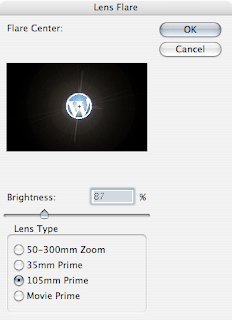
Step 4) Create a new layer above the background layer, but below the logo layer. Using the eye dropper tool (I) select a light blue colour from the logo. Using the colour fill the new layer you have just created. Set the layer blend mode to colour. The white lens flare you have just create should now be a cool blue colour. Adjust the opactiy of the new layer if needed.

Step 5) The next step is to apply some lighting behind the logo. Duplicate the logo layer. You can at this point place it behind the logo or wait till the end of this step. With this new layer go to Image > Adjustments > Brightness/Contrast and set the brightness to full.
The next step is to blur out the layer. Go to Filter > Blue > Gaussian Blur and blur out the image. I've chosen a value of 30. You may need to change this depending on the size of your image.
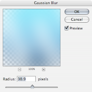
Step 6) Set the blend mode of the layer to Hard Light, duplicate this layer and change this blending mode to Overlay. This will create a subtle light around the logo.
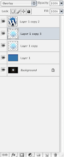
The logo now shines. Since the white shine was created with the logo it doesn't look to fake, since the original logo was used.

Step 7) You could at this point finish. Since the image does look good. But I want mine to match the one I have found.
The next step is to add a streak of white. Create a new layer underneath the logo (mine is shown ontop) and add a white streak with a soft brush. It wants to be around 30 - 40 pixels. Make a nice simple sweeping action around the bottom. Apply, again, a Gaussian Blue of about 5. To blur this out. Set the mode to Overlay.

Step 8) Duplicate this layer you have just created, and smash Cmd + F (Ctrl + F on Windows) half a dozen times, this is to reapply the blur. Change this layer blend mode to soft light (seeing a pattern with the blending modes?)
 Step 9) Duplicate the last layer again, and remove the blending mode. Reduce the opacity. This can be an optional step, since my white flare looked a little to blue.
Step 10) One of the features of this logo lens flare is the small circles. This "traditionally" looks like a lens flare. It is easier at this stage to create one manually using the brush options in Photoshop.
To create the brush style find a hard brush about 20 pixels in size. Open up the Brush Dialog Box (F5 Window > Brushes). In the Shape Dynamics box change the jitter to 100%. This will make the brush strokes move about.
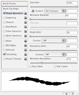
Next in the Scattering section change the scatter to about 600% and the Count Jitter upto 100%. This will move the placement of the brushes strokes around on the x and y axis.
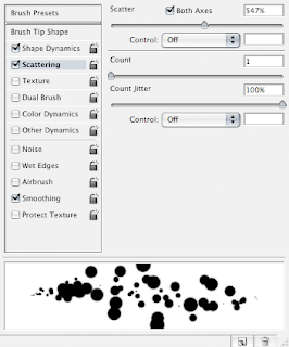
Step 11) Using a yellow/orange colour apply a small amount of jitter on a new layer. Do not over do this. It wants to be a subtle as possible. Do the same with a blue colour.

Step 12) On these new layers (I have 2) change the blending options to screen to reduce the amount they are visible by. It is a good idea at this point to erase and re-do any parts you don't like. As well as this experiment this the Gaussian Blur in blurring out the parts.

Step 13) The next step is to add a swoosh at the bottom of the logo. On a new layer again use the Circular Marquee tool to create a circle on this layer. It doesn't have to be perfect. Then go to Edit > Stroke and set the stroke to 3-4px depending on how it looks. If it is to big/small undo and change the size. Change the colour to white.
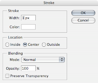
You should have something like this.

Step 14) De-select the Marquee (Cmd/Ctrl + D). With the Swoosh layer still selected go Filter > Distort > Twirl. Twirl this layer. At this point it doesn't matter how you twirl it. I wouldn't recommend doing it to much. If you don't like what has been achieved undo and re-apply the filter. When you have a nice twirl, remove with the eraser the top part. Move (V) is necessary to a new part of the canvas.

Step 15) Set the Blend Mode to Overlay and repeat the twirl if necessary.
Step 16) Crop into a letter box shape and save out. You can click the image below for the full version.

I hope you liked this tutorial, it can be applied to nearly any logo. Please leave a comment.
From great-design.blogspot